
Volume Software is pleased to introduce ReflexClient version 4.6. This version introduces a complete overhaul of the Cubes module, with a new user interface and new features.
Cubes
Redesign of tables
Construction
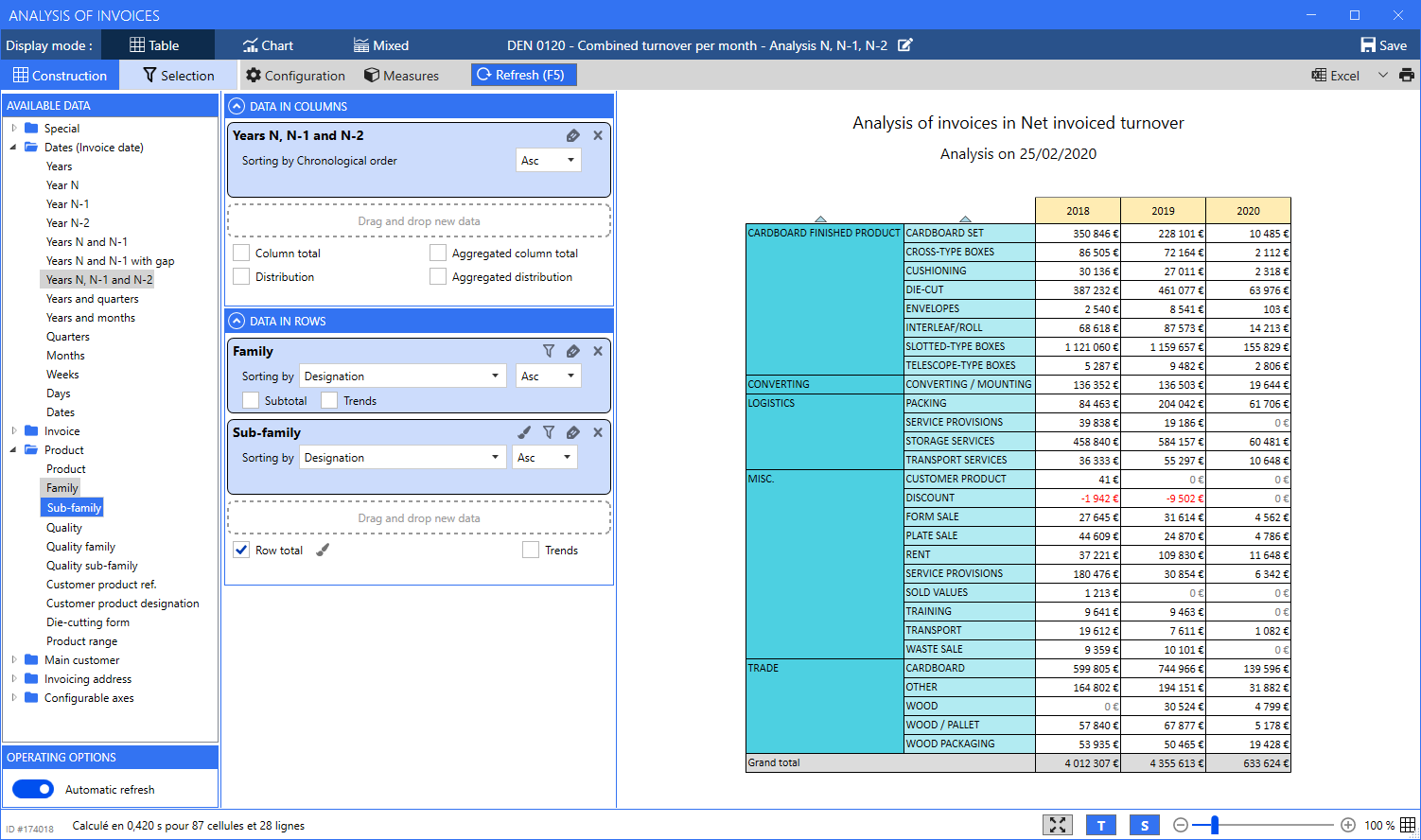
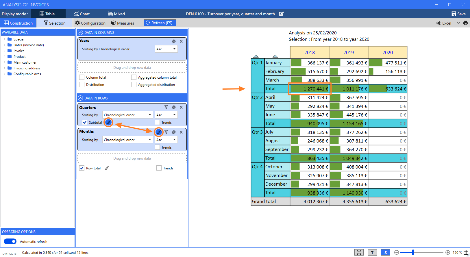
Although we made a visual redesign of this screen, we kept the global principles that you are familiar with, including the ability to drag/drop data from the catalogue of Available data towards Data in columns and Data in rows axes.
By default, tables are now automatically calculated and refreshed as long as there is at least one piece of data in row and in column.
When building the table, ReflexClient automatically chooses the best suited zoom level to display data optimally. You can customize this zoom level using the Ctrl+Mouse wheel shortcut, or using the cursor at the bottom of the screen. This zoom level is retained when saving your template.
The increase the readability of tables when scrolling, line and column headers are now frozen.
In data axes, multiple options are now available to:
- Colour the cells with a colorization method expressed as a background colour (below) or as bars. Please note that when the table includes multiple levels, the colorization icon for the inferior levels is located next to the “Subtotal” checkbox (in purple below).
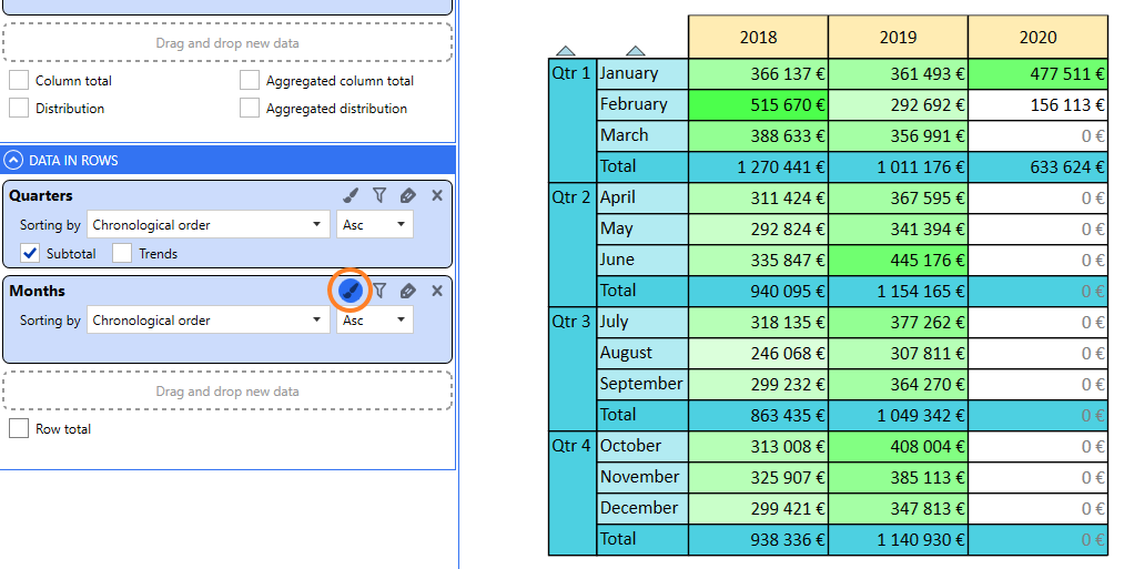
Note: the bar colorization mode was redesigned to offer more readability, taking as a reference (100%), the highest value in the colorized cells:
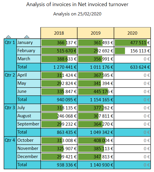
In the following example, we chose to add a colorization of quarters. Then, we notice that the reference value moves to the total line for the first quarter 2018 (new highest value) and that all the other bars are calculated in relation to this value.
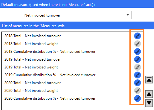
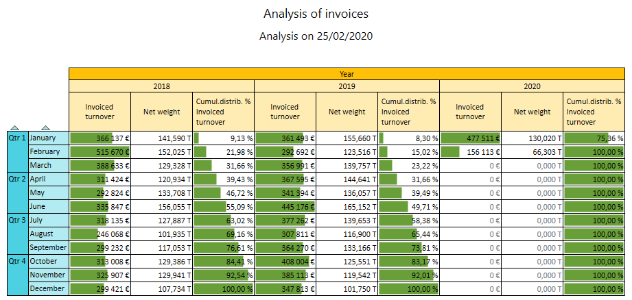
In the configuration of measures, you can now choose the measure for which enable/disable colorization. In the following example, we analyse the invoicing through indicators of turnover (with colorization) and indicators of weight (without colorization):
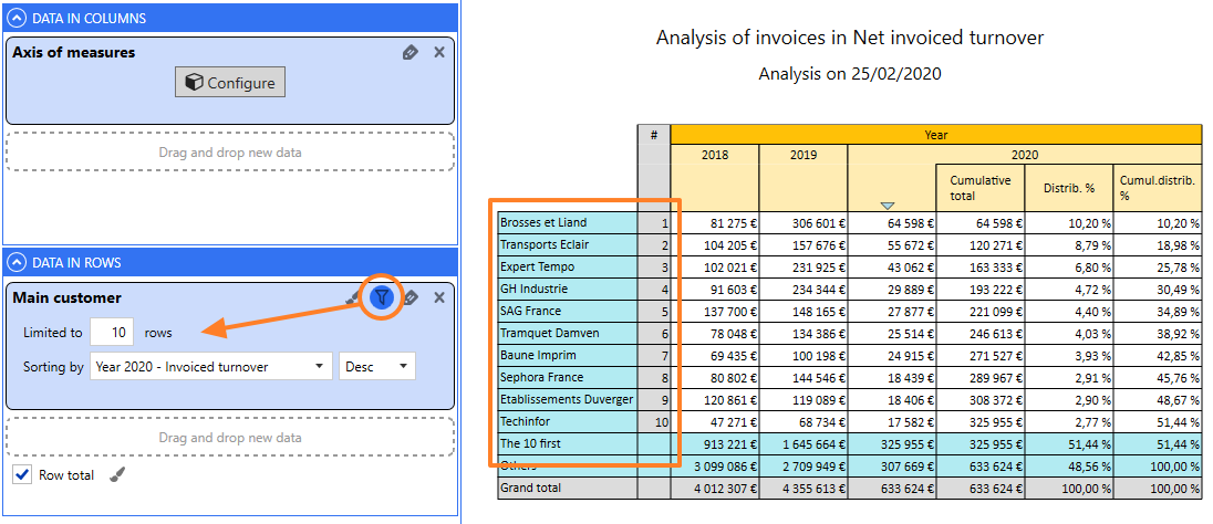
- Filter the lines to display, in order to limit their number.
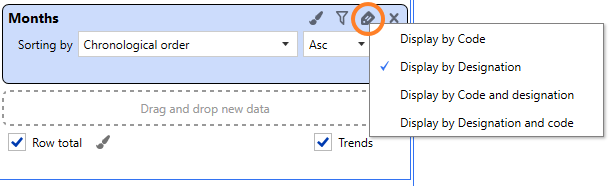
- Choose the designation to display, in order to simplify the screen layout.
For example, this will allow to display only customer designations or only product codes, etc.:
Size of tables
In previous versions, very big tables were not displayed and, instead, proposed an Excel export. This is no longer the case with this version: very big tables are supported (with the Excel export remaining naturally available).
Table themes
The new configuration screen now offers you the ability to customize table themes:
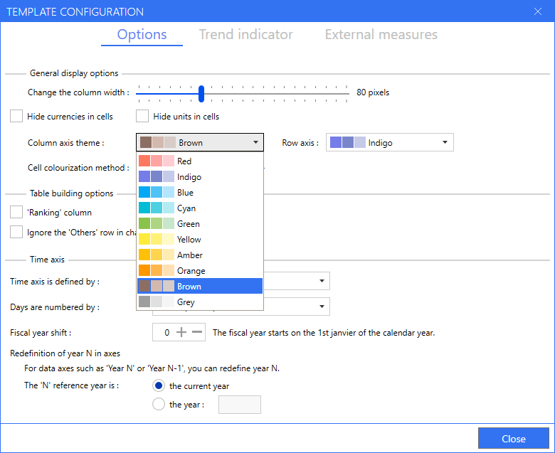
The three colour gradients are used for the various data levels.
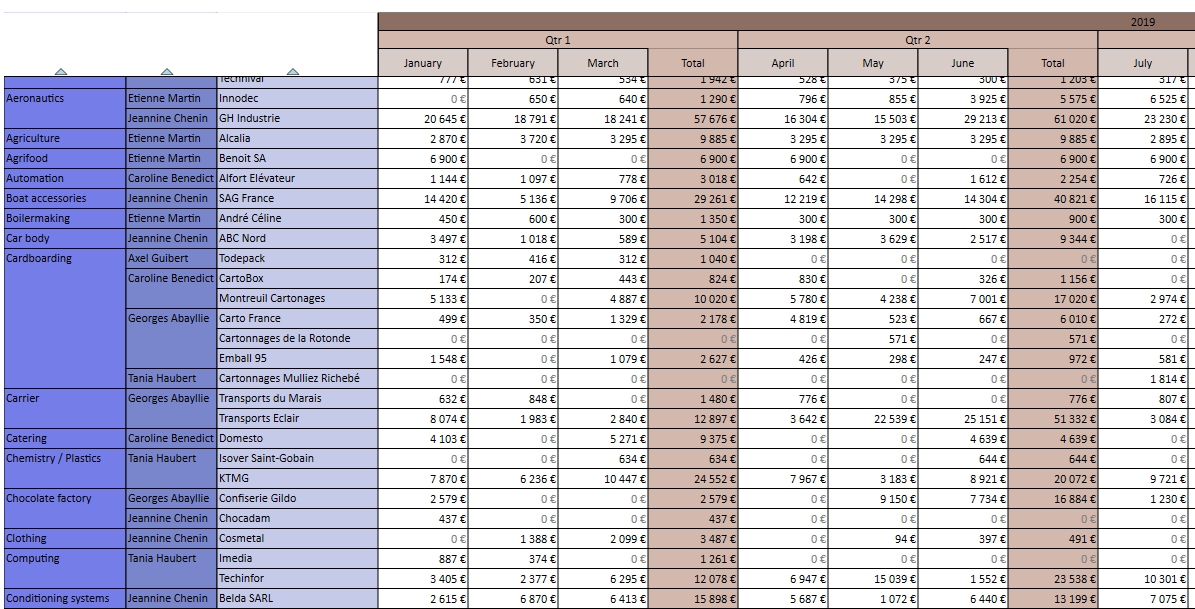
Here is an example of table generated with the theme presented above (Brown/Indigo):
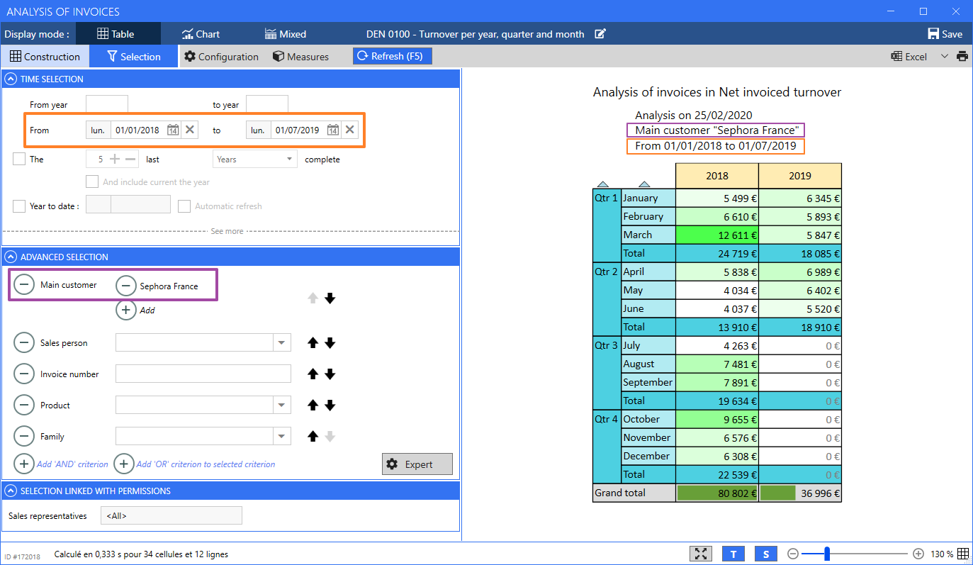
Selection panel
The selection panel was revamped in accordance with what is available in the CRM.
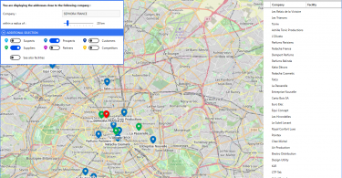
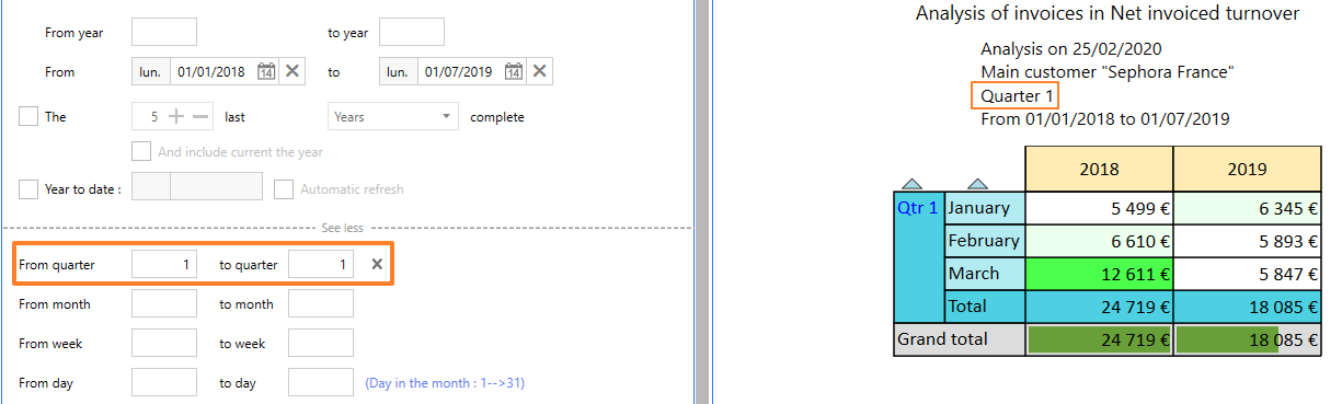
The Time selection and Advanced selection panels allow you to respectively select the analysis period (in orange below) as well as the analysed data, grouped by categories (below, in purple, the filter is on the main customer).
Clicking on See more gives you access to a new menu to refine your selection, for example to select only certain quarters:
Redesign of charts
Globally, you will find all the charts that you already know, in a modernized version offering better readability.
Beyond the visual aspect, we added the following functionalities to the Chart mode.
New tooltips
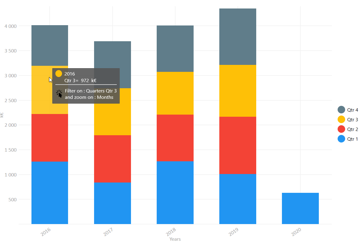
You can choose to display the charts with or without their associated values.
The example above is a chart displayed without the values. You just have to hover the mouse over a segment to display its value. Above, you can see the tooltip displayed when hovering the mouse over the 3rd Quarter of 2016.
Because the chart above is detailed by quarters, it is possible to click on each segment to apply a filter on quarters. Below, we clicked on a yellow block in order to compare the values of Quarter 3 for each year. As the table is also detailed by months, the click now enables to display a detail by month. The chart legend informs us that data is available for the months of July, August and September.

Applying the same logic, we now clicked on a red block in order to compare the data for August from 2016 to 2019 :

New charts
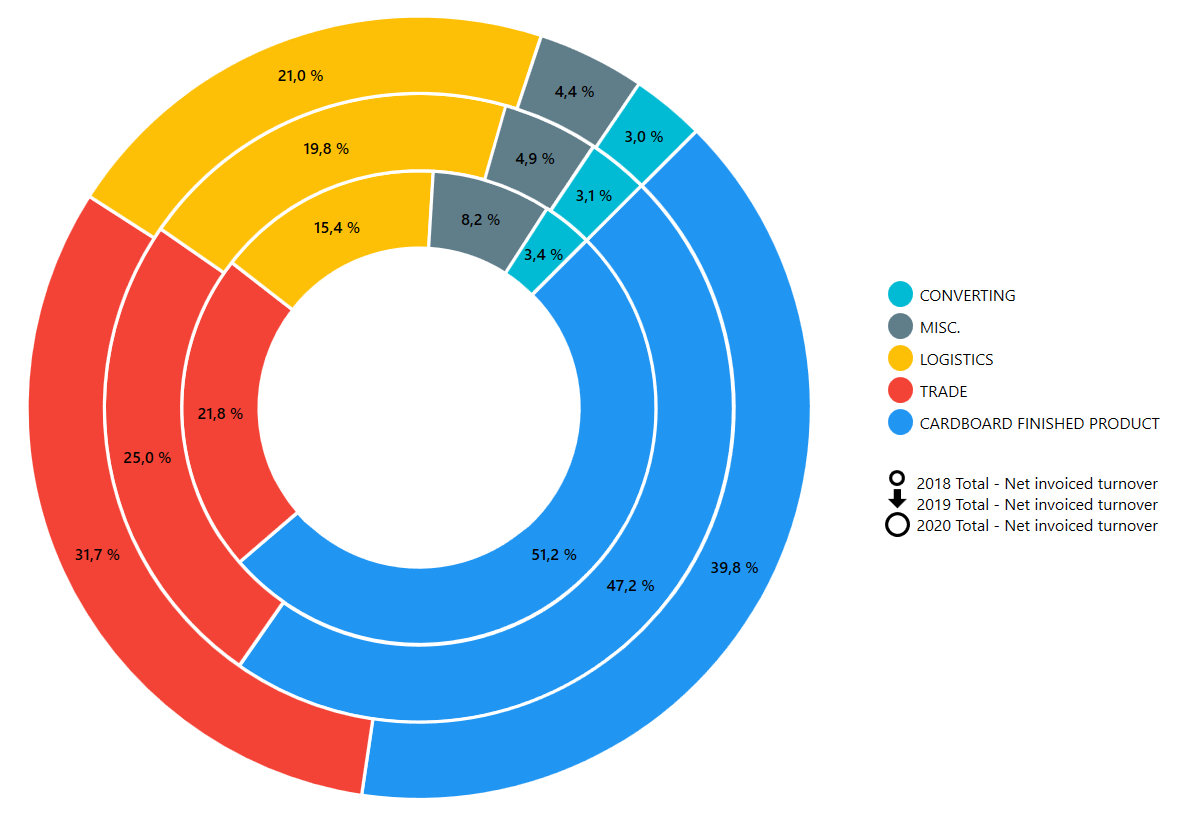
Multiple rings
Exclusively available with measure axes, the Multiple rings chart enables you to display up to 6 concentric rings on a single chart, in order to perform instantly distribution comparisons.
In the example below, we compare the net invoiced turnover per product family for years 2018, 2019 and 2020. The legend indicates the correspondences between families and colours, and pictograms representing growing rings indicate the analysed years.
Heatmap
This chart matches each segment to a colour which turn progressively from white to red, based on its value.
For example, below, we analyse the invoiced turnover by quarter and year. We can see instantly that the highest amounts invoiced were during the 1st quarters of 2016 and 2018. Conversely, we can easily see that the 1st quarter 2020 is the one where the invoiced amount is the lowest.
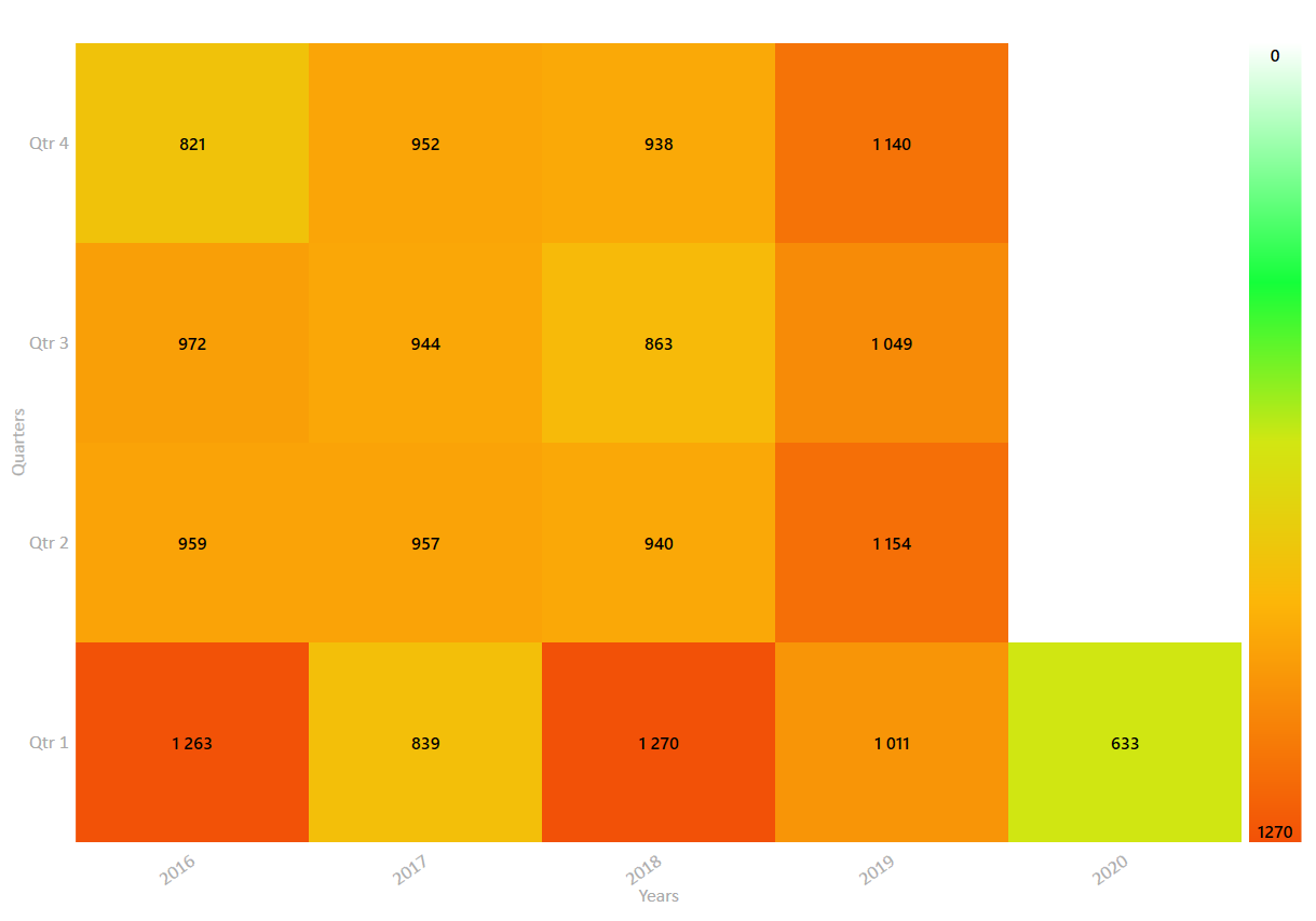
Analysing this data in rows enables to see quickly the evolution of a value over time.
New “mixed” mode
The mixed mode now enables you to combine the Table and Chart display modes:
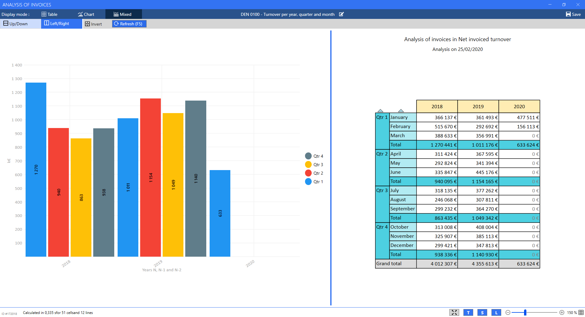
The display of the mixed mode is highly configurable: Up/Down and Left/Right buttons allow you to choose if the chart and the table will display one above the other or one next to the other, while the Invert button enables to invert the position of the chart and table. Note that it is also possible to assign more or less space to each element by moving the separator (above, the separator is slightly moved to the right in order to give more space to the chart).
You can adjust the zoom level independently for the chart and for the table using the Ctrl+Mouse wheel shortcut, or using the cursor at the bottom of the screen. The pictogram in the bottom right corner identifies the element affected by the zoom. Note that the the position of the separator and the level of zoom are saved when you save your cube.
The lower part of the screen has a new toolbar with buttons to switch to full screen (presentation mode, also available with F11), to show/hide the table title (T), to show/hide the table selection (S) and to show/hide the chart legend (L).
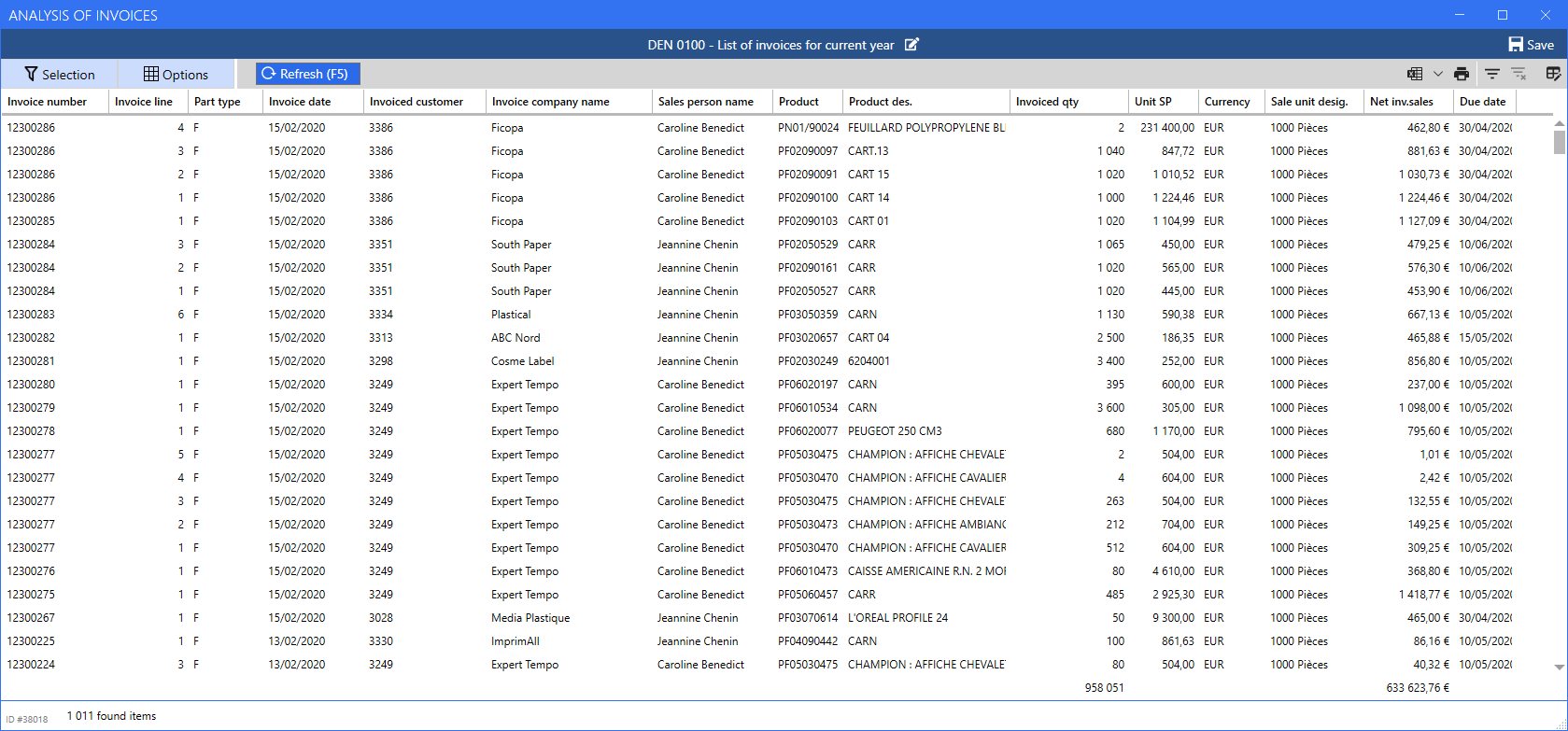
Listes
List screens were redesigned to offer a homogeneous graphic experience between Cubes and Lists.
You find all the functions you are familiar with, now reachable using the Selection and Options button in the upper part of the screen.
CRM
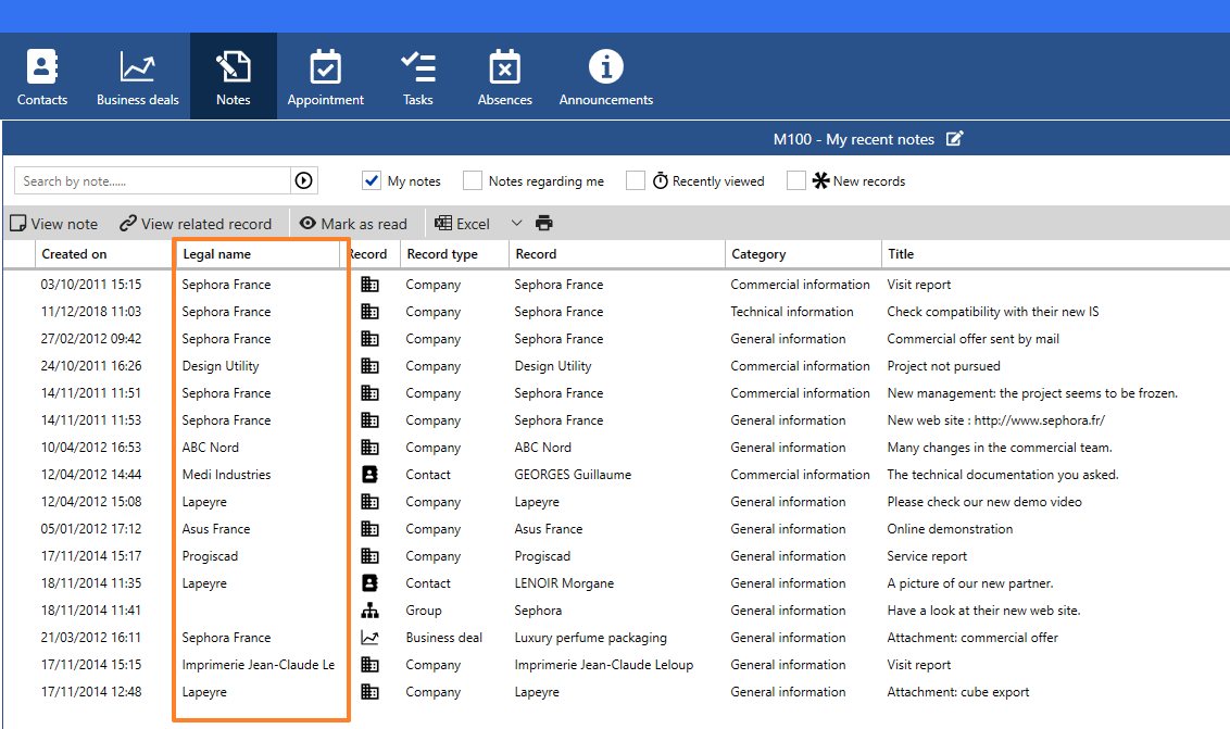
Display of notes
To identify more efficiently the affected company, it is now possible to display the Legal name column in the general Notes tab.
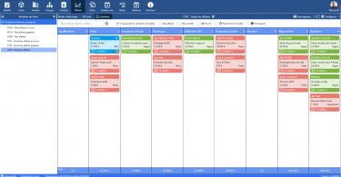
Business deals
In the Business deals tab, a new entry in the Configure menu enables to customize the display in Columns mode.
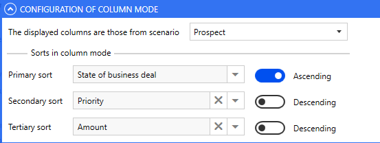
The first dropdown list allows you to choose the columns to display depending on the configured scenarios, whereas the sorting options will determine the ranking of the business deals within these columns.
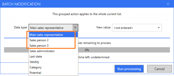
Grouped actions on companies
n addition to the main sales representative, it is now possible to perform the batch update of sales representative 2 and sales representative 3.
Multilingual interface
In addition to French and English, ReflexClient is now available in Polish language.
You will find all these new features of ReflexClient in our brochure.